3 Ways to Remove Confusion on Your Donate Page
If your radio station or organization relies on donors to stay alive, then donations contribute to a large part of the resources needed for your daily operations. That being said, you should spend time and energy investing in your organization’s donation page. However, if you don’t have much experience running online fundraising campaigns, confusion can grow. Today, Killer Bee Marketing will show you how to optimize a donation page and drive more donors to your site. ?
Provide Clarity
Create a story for your donors that tells them about your organization’s cause or the person you’re trying to help. If you run a not-for-profit radio station, having a clearly detailed donation page is vital. If you’re not providing answers to the following questions, people will be less motivated to donate to your organization:
- Who am I giving to?
- Why is my donation needed?
- How will my donation be used?
Don’t assume your donors will know everything about what your radio station does. Making assumptions about what your audience already knows about your station can hurt your fundraising efforts. Instead, by focusing your attention on providing clarity and answering these questions, you can establish trust and understanding towards what they are donating to. ?
Remove Clutter & Friction
A common mistake many organizations make is directing all their traffic to the same donation page. This “catch-all” method results in your message getting lost when prospective donors click on your ad and land on a one-size-fits-all donation page. Instead, create a designated donation landing page that will encourage more engagement and eliminate your donors’ confusion. Remember, minimal navigation and giving clear instructions are essential to successfully take them through the donation process.
If your donation page includes many large images at the top, it could bury your donation button. Think mobile. You can use CSS code to hide pictures on mobile view and make it more user-friendly for people to make donations anywhere their smartphones or tablets take them.
Lastly, remember the donation form is not a survey. ?Remove questions that are not necessary for them to answer. The easier the donating process, the more likely they’ll complete it. The same thing goes for hidden donation forms. If a donor can’t find your donation page, it increases the chances of that opportunity to convert getting lost. According to Sleeknote, the abandonment rate for mobile users is roughly 86%. Similarly, if a user needs to wait more than three seconds for your page to load, there’s a 57% chance they will abandon their cart.
When determining how to optimize a donation page, ensure that your audience can find what they need quickly. With minimal to no interruption, it will increase your conversion rates and lead to more donations.
Remove Fear
When people are donating money online, they provide you with personal and sensitive information about themselves. People are less likely to donate if they’re concerned about security, even if the page is secure. Suppose your donation page doesn’t reassure people that their data will be safe. In that case, you could be losing out on donations across all generations: boomers, millennials, Gen Xers, and other potential donors.
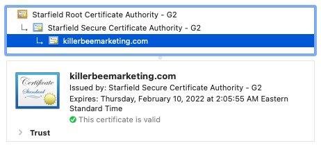
Ensure your site uses HTTPS, has a valid SSL certificate, and ensures your donation page complies with Payment Card Industry Data Security Standards.

Some people recommend adding proper security trust logos (SSL), though some say it doesn’t improve conversions. If you decide to add security trust logos to your donation page, you should track the conversions to see which approach performs the best with your audience. You can also add statements and banners to your donation page that demonstrate the higher security level on the page. By taking these proactive steps, you reassure your donors of your credibility and show that you care about their privacy.
Aside from the fear of security breaches with their personal information, people often have a fear of regret towards their donation. As hard as it might be to believe, research has found that people often fear they will regret a past action than past inaction.
One more tip. Don’t use stock photos of people on your donation page. People are cautious about being scammed with so many fake organizations masquerading as a not-for-profit, and stock photos may give that impression. Instead, use your fundraising campaigns as a way to build your own photo catalog that you can use on your donation landing pages.
All businesses struggle with overcoming barriers when trying to market themselves in a new way. Don’t let fear and lack of knowledge keep your organization from gaining the donations and audience needed to succeed. Contact the team at Killer Bee Marketing and remove the confusion from your digital marketing strategy. Let us help improve your conversions and show you how to optimize a donation page.
ℹ️ Please keep the comments free of promotions or sales pitches. Any comments containing such content may be marked as spam or edited before publishing.
You may also like
It's More Than Digital
It's A Mission
serving those who serve others


